Glaze + slip tests: Sept-Dec 2020
‘potter’s palette’ base glaze 3, with 5% rutile
the base glaze 3 from the potter’s palette book (high-fire, suitable for both oxidation and reduction), with 5% rutile added, was one of the glazes i identified as potentially interesting last academic year. in the book, the thumbnail picture of the glazes shows it as a creamy off-white colour with a ‘crackly’ quality to it, lots of breaking, and a pearlescent finish.
why test this glaze?
i loved the complex tones it had in the reference images - it emerged well in both oxidation and reduction, which would make it flexible & thus easy to use. i had also really liked some effects i’d seen with rutile glazes last year - the swirling, pearly patterns of colour that it produced. i hoped that this glaze might produce an off-white variant of that effect, suggesting the glittering beauty of a morning frost, or ice crystals on a bright but freezing winters’ day.
all these test tiles were fired in oxidation, as having a good outcome there was my first condition for the usefulness of a glaze.
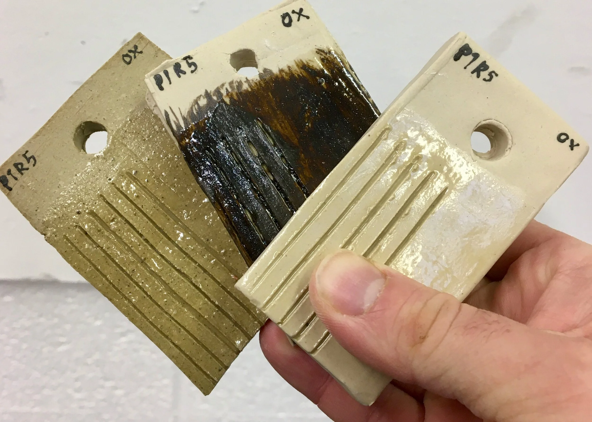
on buff: glossy, transparent. ugly and uninteresting.
on arctic white s/w over pre-mixed black slip: similar, but with a slight pearlescent shimmer. the slip has gone a hideous chocolate-brown - terrible! would mixing my own from Vulcan clay make a truer black?
on arctic white stoneware: more pearlescence coming through here - would a thicker application make this emerge more strongly?
evaluation
certainly, none of the test tile outcomes looked much like the reference picture i had so liked. on buff and over the awful-looking black slip the results managed to be both boring and ugly. there was something a little promising to the arctic white sample that suggested a thicker application would be more rewarding - but i still didn’t like how shiny the finish was.
‘The Glaze Book’ satin white
i had used this in my first year quite successfully over cobalt oxide & with granular feldspar incorporated into the body.
why test this glaze?
i had previously liked the thick, almost liquid quality of this glaze when it had been over the very highly textured pieces i had made last year. then, the underlying cobalt oxide had shot the glaze through with light bluish tones, at times shading to the palest violet. after these interesting results, i wanted to check what the white was like on its own so i could assess whether to pursue it further.

above: the ‘Glaze Book’ satin white over arctic white stoneware (left) and buff stoneware (right)
ibett/hirai crater glaze
one of my priorities with glazing is to experiment with a volcanic/’crater’ glaze, wherein silicon carbide creates a surface full of breaks and ruptures. i identified this recipe on glazy.org, logged by kenneth ibbett, who specified that he had been given it by akiko hirai when under her tuition.
why test this glaze?
i am really interested in the prospect of creating a highly textural surface, so experimenting with a crater glaze seemed an obvious step. when researching a recipe, i was actually surprised at to find one quite hard to come by, so am very thankful for kenneth ibbett’s glazy entry.

britt crackle slip (modified)
i was keen to try this recipe from John Britt’s The Complete Guid To High Fire Glazes (p62, in the 2007 edition), as i had been looking for a crackle slip recipe, unsuccessfully, for months. however, i was initially uncertain how to proceed with it as it called for a couple of ingredients i didn’t know of. in the book, the recipe reads as below:

evaluation of progress so far
whilst i haven’t yet got the results i want exactly, this is a glaze to continue testing with. when Michaela looked through my test tiles towards the end of term, she stressed that they simply were not big enough to get a proper idea of how the glaze will behave - i need to test it on a larger scale.
this being the case, my plan going forward is to continue to test glazes + slips using practice pieces i produce during throwing. whilst i know that arguably this isn’t the most efficient way to do testing in the long run, it seems to me that, for the time being, it may be - because i will be producing pieces to experiment with forms anyway, and often may want to fire things so as to have them as visual references, and to experiment with how they feel and ‘work’ as objects. thus i will be firing at least a selection of the best/most promising forms i make - so it makes sense to use them as testers for slip and/or glaze at the same time.
recipe
potash feldspar 50
dolomite 20
china clay 20
+ rutile 5

^ on the Vulcan, the rutile in the glaze appears to have reacted differently - it has a similar ‘crackly’ finish to the reference image in the book, though it’s a much deeper light gold colour rather than the subtle off-white shade pictured. perhaps this is to do with the additives in the coloured body? it’s much more interesting than the earlier tiles of the same glaze, but is still quite different to the exemplar.
meanwhile, the reaction on the Vulcan clay, while unexpected, was also rather appealing. it was only after getting this test tile back that i realised that a couple of pieces i’d fired in reduction at the end of last term had actually had this glaze on them too.
the issue, though, is that though the results on Vulcan clay do have appealing qualities, they don’t really have the aesthetic qualities i want to pursue.
recipe
potash feldspar 45
dolomite 22
flint 16
zirconium silicate 11
china clay 6
unfortunately, on its own this glaze looks bland and featureless. its shine is also far more apparent on its own than it was over the cobalt & on the heavily textured surfaces i used it on previously - it does not appeal to me at all. it feels static and artificial - perhaps because it is a very ‘true’ white, with little complexity or tones of other colours.
evaluation
if i return to this glaze in future, it will be to once again layer it over cobalt oxide (or possibly iron oxide) as these earlier pieces were quite interesting. however, even if i do return to it it is likely to be in my free time rather than for my MA work proper. this glaze simply doesn’t seem visually or physically interesting enough to warrant focusing on.
recipe
nepheline syenite 60
barium carbonate 18
china clay 11
flint 10
+ rutile 2
+ silicon carbide 2
for me, the obvious first step was trying the glaze on Vulcan clay. (ibbett specifies hirai often uses the glaze over black slip, but after my previous discovery that the pre-made black slip i’d bought fires in oxidation to a very unlovely chocolate brown, i decided for now to simply test it on a body i knew would fire to a good black).
left: first tests came out rather thin, but still promising; i like how the surface has a textured quality, even though i had hoped for a more dramatic volcanic one. to take this further i will need to test both thicker applications, and on larger pieces to get a more complete idea of how it performs.
recipe
potash feldspar 20
china clay 15
calcined china clay 20
ball clay 15
silica 20
borax 5
zirconium silicate 5
>> as you can see, i marked it up after asking tutors about the ingredients: for custer feldspar, an American variety not available here, i am using potash feldspar; and instead of zircopax, an ingredient which is no longer used as it is hazardous to health, i am using zirconium silicate. i was also confused as to what ‘calcined’ kaolin is - Britt does not elaborate - but we worked out that it denotes kaolin/china clay which has been put through a bisque firing.